Creating a Happy, Colorful, Handmade Home & life on the shores of lake superior

April 18, 2011

Abstract Painting How-to + New Kitchen Photos

The painting I made for the kitchen really breaks a lot of "rules" about art.  I wanted something pretty, something vintage-y but modern, something that "went" with the kitchen & I set to work with these goals in mind, which is a big no-no for many professional artists and I respect that.  Art is about more than decorating.  So, I want it to be clear that what I've made is really more "craft" than art.  A fun project, a hobby I enjoy, and not an artistic statement.

Finally - a slightly sunnier day for a fresh new photo
P.S. Ignore the bananas, we're on a fruit smoothie kick

How-to:

First I bought a large square canvas on sale (I have been stockpiling them whenever I find a good price).  I tend to just move paint around as the mood strikes (see here & here for examples of other paintings I have made), but this time I challenged myself by doing something a bit more controlled: circles.  I cheated and sketched them out first:


Then, with a variety of paintbrushes (one big, a couple small - all with shorter bristles for more precision), I worked the circles and background alternately so that there would be "movement" - I didn't want the painting to look like a flat wallpaper pattern (although that would look nifty too).  I used my brushes to create subtle texture and followed the perimeter of the circle with paint, instead of painting across the circle.  I used acrylic paint because I like the fast drying time and easy clean up - plus you can easily paint over areas you don't like!  That is something I definitely did once or twice.


Mmmmm . . . textured.

My tip: to make a crisp, clean pastel (think Easter & nurseries) use a white like titanium white.  For the vintage-y pastels (you can really see the difference in the pink circles) use titanium buff.  You'd be surprised how little of the coloured paint (red + white for pink, etc) you need.


Inspiration:

Although I was initially inspired by the pattern on a vintage lunch set I have (first photo), I used the painting to unify elements in the kitchen: the red accents, black & white floor, black & white houndstooth chairs, and (of course) the pale green and turquoise that I love.

My original inspiration: my vintage luncheon set
 (there's two more with the set!)

Black & white floor we've chosen to work with
(as opposed to replace)
   
Black & white houndstooth print I chose to recover the chairs with,
to go with the floor


Colourful kitchen accents

I also tried not to compete with the artwork in or near the kitchen, like Hubby's grandpa's painting (below) or my mom's print (above the kitchen sink).


And that is it!
To see more kitchen pictures (or to read about the "before," the backsplash tiling process or how we re-varnished the cabinets, click on the links). 
SHARE:

April 16, 2011

My DIY Fail

You know I've been getting closer to finally hanging my silhouette collection (which, aside from two my Hubby gifted me, has never, EVER been hung).  I've blogged about silhouette arrangement inspiration twice (see here & here) so that is a good clue as to what is brewing in the townhouse.  I thought the collection would look more sharp if I painted some of the random, tacky frames (see pics below) black so they all match in colour, but differ in texture.  And, it would save some bucks (as opposed to buying new frames).  I even bragged about the saving money part to Hubby.

Before - all different frames
Here's a close up of one of the offending frames

Pouncing on a rare warm day, I set to work.  I sprayed and sprayed and sprayed.  I'm no stranger to this kind of project but I tend to only buy Tremclad paint as I typically paint metal surfaces (like the base of my DIY'd desk).  But this (new to me) brand did something weird.  From afar the frames look okay:


But close up, the surface has turned all bumpy in some areas.  Perhaps the weather wasn't warm enough (the instructions suggested 10 degrees celsius + and it was . . . ), or the can was defective.  Anyway, take a look at the damage:

DIY gone wrong.


They would pass in the dark with a shove, but I just gave up & bought new frames to replace the damaged ones.  I even found the perfect sized round frame for my newest silhouette

BIM - Bought It Myself

Next up: I finally found a frame for my magnetic chalkboard project.  Let's hope I don't goof this up too.


P.S. Hubby was so cute: he thoughtfully helped me pick out new frames and never once laughed about my genius plan to refurbish the old frames.  He didn't complain that I stunk up the garage for no reason, or got paint on the floor, or left him with a pile of random junk to deal with when the project & I decided to abruptly part ways. 
Read more »
SHARE:

April 15, 2011

Modular Idea to Steal

Do I ever have a blooper of a DIY to show you all.  I really bunged something up.  Pics soon, I promise.  I know I am piling up the promises. . .

In the meantime, check out this really fun DIY suggestion.  As explained over at Maurice & King, you just paint these IKEA boxes and clip together with bulldog clips.  Even substituting glue makes this fantastically easy.  Heck, the colour palette used for this project is a steal-worthy idea!

Source
Found Via Door Sixteen
then spotted on Maurice & King
Read more »
SHARE:

April 13, 2011

Art Attack: Pottery That Soothes

A very busy week for me so far - how about you?  I was actually feeling a tiny bit frazzled today, which is odd because apart from a few (hilarious, I'm told) bursts of stand up comedian type anger every now & then I am normally pretty calm. 

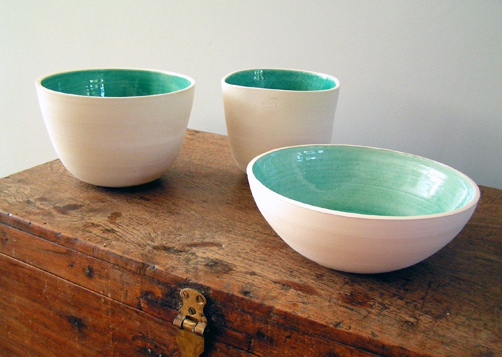
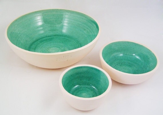
Happily, these lovely pottery pieces by Netherlands etsy seller Miip are so simple & serene that I feel more relaxed just looking at them.  Imagine a collection on a dresser . . . See?  I'm so distracted I don't even remember why I was stressed!

Large deep Platter, Handmade Ceramics
Source

Large deep Platter, Handmade Ceramics
Source
Sigh.
Read more »
SHARE:

April 12, 2011

Abstract Painting Completed

Yesterday morning I blogged about how the weather was dreary.  Well, it cleared up midday, but I was busy filling out an application for a scholarship (that required a medical - sheesh).  By the time I was ready to take some pictures it was becoming overcast again but I took pictures anyway, thinking it would only get drearier.  Then I went back to work on the application and when I took a break for dinner it was brighter, but the sun was heading downwards.  The lesson here is that the weather is seriously screwing with me.

But I prevailed.  I have some photos to share, although they are a touch gloomier than I prefer.

Remember this blank wall in our kitchen?


Now it looks like this:


From the other angle

This is without natural light - darn cloudy skies!


Yep, this is the painting I started days and days ago.  When it comes to non-essential projects I operate on "Tanya Time," which runs a bit delayed due to frequently distractions. 

Tomorrow (possibly Wednesday . . . Thursday if we're talking Tanya Time) I will post about how I DIY'd this painting.  Along with blogging about what I did (which is really straightforward) I'll show you what colours I mixed to produce crisper pastels or vintage-y pastels (there's a trick).  I will also post about the other, newer splashes of colour peppered about the kitchen and what elements of the room served as my inspiration.  It has certainly been a while since I posted anything new about the kitchen (other than the post about the fridge).  Let's hope the sunlight cooperates!
Read more »
SHARE:

April 11, 2011

Art Attack: Gerald Ferguson

I finally finished my painting!  But it is SO dreary & rainy here today, I can't take a proper picture.  It is so dark and blah.  Argh.  Hopefully this afternoon the weather will clear up.  In the meantime let's chat about an artist I have been googling.  I am currently loving Gerald Ferguson's work.  To me, although some of his pieces lack colour, they are so peaceful but interesting - like the one he is photographed with, below.

Photo Source

I love this installation piece he did:

1,000,000 Canadian Pennies
Photo Source

I won't be installing any pennies of my own, but I do find his work inspirational:

No. 27
Photo Source

250 ft of Spiral Hose
Photo Source

I recently saw one of his pieces in real life.  Unfortunately, I can't find a "snaggable" pic, so click here if you want to check it out.  The photo doesn't do the subtle texture justice.

The painting, artist unknown, really reminds me of Ferguson's work:

[2596237892_650f71b8e5.jpg]
Blueprint Magazine, via Decorology

Maybe it is the sad, sad weather, but I'm feeling "mellow" today.  No bright colours for me today.  In fact, I'm planning another painting for the half bathroom that will be all texture & movement, but subtle colour.
Read more »
SHARE:

April 9, 2011

It Must Be the New Blog Header . . .

. . . because I was just given a Stylish Blogger award by the lovely Amy, from Brushed Satin

The rules: after linking back to the lovely blogger who sent me the award, I reveal 7 things about me & pass the award on to 10 bloggers I deem stylish.  Thanks to Amy for letting my know she pinged me, I tend not to notice my own name & blog in print.

So here goes:
  1. I am left-handed
  2. I am a feminist (the make-up wearing, husband marrying kind - we come in infinite variations)
  3. I am currently doing my PhD in Women's Studies
  4. My Undergraduate Degree & Master's Degree are both in Philosophy
  5. I'm struggling to get fit & lose weight
  6. My favorite colour is turquoise
  7. I hate gardening with a vengeance
This certainly fills out the "About Moi" page, doesn't it?

Here are 10 bloggers I'd like to pass this award on to (because of my devious plan: to learn more about their stylish selves):

Noelle from Gray Paint Decor
Dana from Mid2Mod
Caroline from The Feminist Housewife
Pauline from The English Organizer
Kate from Maurice & King
Brismod from Fun & VJs
Michelle from Second Street East
Emilie from Live.Eat.Smile
Lesley from Fabulously Flawed
Kristan from Pretty My World

And don't forget to check out Brushed Satin!

Eegads. That's 10.  Of course, I think so many blogs are stylish.  But these are the rules . . .

Speaking of stylish, how lovely is this print?

Eloise renouf
Little Winter Trees
Print by Eloise Renouf
Photo Via Retro to Go
Read more »
SHARE:

April 8, 2011

DIY Potential: Silhouette Inspired Art

In the comments from yesterday's post about silhouettes, Dana, from the fabulous Mid2Mod, mentioned that silhouettes tend to be a bit less modern than her style and taste dictate.  And she's right.  I have some funky mid-century silhouettes but also some older, late 1800's silhouettes.  (As a bonus history tip, the art of making silhouettes originated in the 18th century but has remained popular for centuries!)  If you like the idea of a silhouette, here are some lovely modern (and DIY friendly) ideas for artwork that capture the feel of a silhouette in a fresh new way. 

You could try a silhouette of a flower or leaf in a fun, crisp colour:

Via Made by Girl

Or, instead of a bust or stuffy pose, try silhouettes of fun poses - you could trace family pictures or even magazine images and then cut out of black paper.  Gina, from the Temporary Nest, has a great tutorial - click here.


Playful Silhouette Art
Photo Source

Or try a bold colour combo, like this red silhouette on a printed fabric stretched and mounted:

Curbly

Have you seen any great modern takes on silhouettes?  Speaking of DIY, I'm almost finished the painting I started weeks ago.  Once it is dry, I will attach some hanging hardware and post some pics.
Read more »
SHARE:

April 7, 2011

Silhouette Display

You know I love a good silhouette (you've seen my growing collection) and I'm always looking for a neat way to display them.  Currently, they are languishing in my basement.  But I just added another to my collection so I think it is plain silly not to put them up somewhere (finally).  Below is a great idea: just mix one in with a random assortment of art, gallery style.  I love how the silhouette was just mixed in with brighter, modern pieces.  Hmmmmm.
 
Domino Magazine Via Fabulous K

But, I think I like them all together, like in the pictures in this previous post, or those below.  I have so many, its a shame to only hang one.  But, I do like the idea of "brightening" up the display with something more colourful.  The cogs are turning.  I'll hang mine soon!

Country Living

Via Oh So Darling

The newest addition to my collection!
Read more »
SHARE:

April 6, 2011

How to Use Pastels in Adult Spaces

With spring around the corner, I feel giddy (enough so that talk of rainbows & chipmunks seems like a good idea).  Also related to spring-ish-ness: I find myself drawn toward rooms that feature soft, muted, mature pastels.  I am especially mad for the combination of a soft muted pink with black & white.

[PD102099kitchenshelf_002.jpg]
Blueprint Magazine via Decorology
[PD102099livingdetail2_017.jpg]
Blueprint Magazine via Decorology

Via Eye See Pretty
Truthfully, I'm even enjoying brighter, more Easter egg pastels:

Decorating Room
But, you should know, that a week ago while everyone was blogging about their tulips and warm weather, this was the view outside my window:


So, let's think warm thoughts for me in the townhouse.  Imagine how jacked up I will be when spring has actually sprung . . .
Read more »
SHARE:
© Dans le Lakehouse | All rights reserved.
See What Inspires Me on Pinterest